
There are an estimated 6,000 people working in visual effects in the UK – most of them clustered around London’s Soho. London has become one of the three international hubs for this burgeoning industry.
VFX professionals are an interesting bunch. They’re predominantly young, have skills that employers can’t get enough of and are highly international.
But they’re also less likely to be union members than workers in the other professions in the movie industry. Their sector has grown up in the past 20 years, driven by companies from the US. The workers have rarely heard of unions, unless it’s in hostile terms from their employers.
The VFX branch of the BECTU sector of Prospect is a lively group, with an engaged committee made up of highly skilled and creative activists. They’ve tried a range of innovative tactics, from piloting kickstarter joining to networking people around sexism in the industry, and running a major professional development show.
At the Digital Lab, we’ve worked with them on a series of workshops and tests, to help them improve the effectiveness of their online recruitment.
Planning the campaign
First up was helping the branch devise a recruitment campaign plan. The TUC’s Organising Academy programme has resources to help with this, and we ran a campaign planning session over two evening branch meetings. We included 12 reps from the branch, with two BECTU staff joining in and two TUC staff facilitating.
In the first meeting, we brainstormed and voted on campaign objectives. There had been a variety of different opinions on the top priorities for the campaign, so this helped to get everyone on the same page for the rest of the planning.
We then looked at targets, and prioritised the ones who could get us what we wanted. That helped lead to a theory of change – an agreed statement of how the branch were going to get to where they needed to be (and how members could play a part).
We analysed potential allies and opponents, and worked out who we needed to influence, and who would influence our choice of tactics.
Only then did we move onto choosing actions that could fit with the plan. Too often campaigns start from a tactic that looks fun, but it’s not necessarily the best way to achieve your real aim, or connect with the people who matter most in a situation.
Devising the message
The group came up with a range of tactics to try out in their campaign. The most commonly agreed of which was to improve their core recruitment materials online.
They wanted to develop a new website for the branch, which could explain to prospective members exactly what the union was, and why they should join it.
They obviously have a lot of people with strong creative skills – a resource many branches would love. It wasn’t a problem for them to design and create a website. They just needed to know the best content and arguments to include to get the result they wanted.
At a third branch meeting, we ran a rapid prototyping process to come up with ideas for the site. We’d identified that convincing non-members to join was its main aim. That led us to looking at a range of other modern services, and how they tackle the problem of convincing people to join up to something that they might not fully understand until they’re in.
If you look at the landing pages for many subscription services these days, you’ll find the pattern they follow becomes very familiar. The precise orders and amounts of content change, but when a page is designed to make people do something unfamiliar to them, given maybe just a few seconds of their attention, common elements tend to be:
- An emotive call to action at the top. Strong imagery, a slogan and a strapline that combine to give people a very fast understanding of the service.
- How the service meets its users’ needs. This changes depending on what people want from the service, but it basically explains why you should want it.
- What the service involves. For those who like to know detail, there’ll be information about what actually happens when you sign up. What will it look like inside the app? How does it work? What will you receive and when?
- User reassurance. If they’re still scrolling, you’re now trying to convince the reluctant ones. Common here are user testimonials, user reviews or awards, social proof from other people, or FAQs to help resolve people’s niggling doubts.
- And most important are big clear sign up buttons – right at the top by the slogan, but also repeated down the page. As soon as you’ve convinced someone, you want them to stop reading and sign on the line!
To produce a landing page for BECTU VFX, we devised a template exercise. We split the branch into pairs, and each pair worked on their own landing page.
They had to come up with:
- 1 slogan
- 1 strapline
- 3 user needs
- 3 service features
- 3 social proof factors
- Comments on the kind of imagery and design the site would have
These were all written on post its, so they could swap them around as they built up their pages.
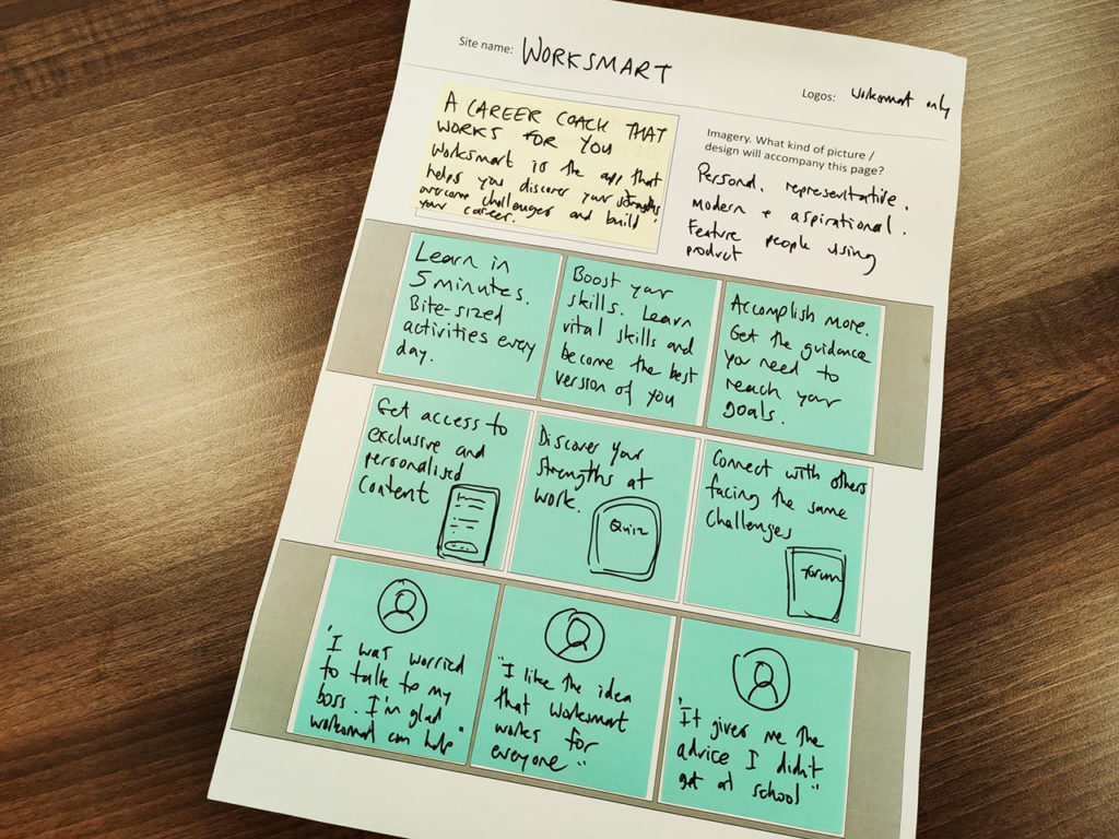
Here’s an example we prepared to help show them the concept. It’s based around how we designed the landing page for the TUC’s pilot careers app for young workers – WorkSmart:
The pairs then presented their pages back to the group and everyone got sticky dots to mark their favourite bits from any of the mock ups.
Looking at the votes, we saw two trends coming out. There was a potential focus around a campaigning union – uniting people around action on some of the big issues in their industry (especially the excessive reliance on unpaid overtime). There was also a potential focus explaining what the union would mean in terms of the potential benefit to an individual member.
As the union aren’t yet recognised in any VFX employers, so don’t have formalised collective bargaining, there’s necessarily going to be a campaigning element in any offer to prospective members, and a personal benefit element. But the mix could be important.
We wanted to test the two prototypes we’d come up with, so we could see what might happen when they were put in front of real VFX workers who had no union connection (as opposed to those who were already active, likely because they already had stronger motivations to union ways of doing things).
Then we let the branch loose in our stock photo library, so they could find imagery that appealed to them as VFX workers. Stock photos are never ideal (always ask a friendly NUJ snapper for the good stuff!), but we were able to find photos that worked. This could only have been done by the branch. Staffers might have picked photos of people who didn’t look culturally like VFX workers (they’re a tribe with a particular look), or offices that didn’t look like their workplaces. Or worst of all, people using tech that didn’t look like the tools VFX workers would use themselves.
Building the prototypes
One branch activist had come up with a nice design for the branch site (feedback from a previous campaign had indicated these workers valued aesthetic considerations, and wanted their union to look modern and design-aware), so we roughly replicated that new look into two prototype sites using the simple site-building service Squarespace.
That gave us a simple grid approach to building a landing page, with clean, mobile-ready design elements out of the box. It also easily integrated Facebook’s pixel tracking element.
It’s easy to get carried away, but to run a test, we needed to focus down on the minimum possible intervention that could give us the insight we wanted. We decided that a one-page landing page needed to be backed up with a simple join page (to track conversions).
Rather than a working join form, this would just be some content about joining for now, with a link to the regular BECTU join form to let anyone we had convinced join if they wanted. Some activists thought we would need to convince non-members (VFXers are a cynical bunch), so we also added and tracked a simple FAQ page as an onward link if people made it to the bottom of the sign up page and still weren’t convinced.
We also made sure to put in links to the parent union and its privacy policy, and set the sites up on domains that looked convincing – vfxunion.co.uk for the member benefit focus prototype and vfxunion.org.uk for the campaign focus one. Whilst the sites were bare-bones efforts, we didn’t want them to look like scams (another point of feedback from previous user research).
Running the test
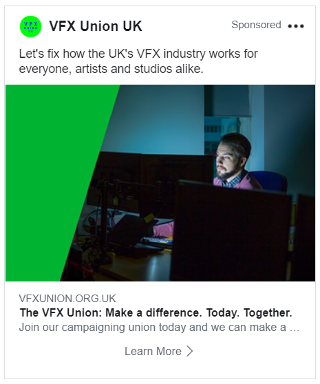
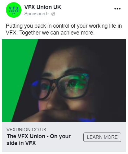
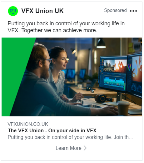
Once the two prototypes were ready, we devised two sets of Facebook ads, one leading with the campaign messaging, and one with the member benefit messaging. We made 4 of each, using the same 4 photos on both sides.
We created an audience in Facebook ads, trying to target VFX workers. This included:
- said they worked at a couple of the major employers (this is getting harder to target by than it used to, with fewer employer options).
- had job titles that we were looking for.
- had listed fields of study that were common for these workers.
- liked industry insider pages (like the VFX Society or key animation software)
We wanted to cut out those who weren’t relevant (eg VFX movie fans, or those who hoped to work in the industry after study) so we restricted the audience too:
- Only those over 20 (who had finished studies and were more likely to be working) and under 60.
- Only those who had been in the Soho area recently.
- Only those who didn’t already like the branch’s active Facebook page (so were less likely to have been exposed to the union).
We specified one campaign with a common budget of £250 for both message sets. There were two ad groups (the two prototypes) with the same maximum spend each, and four ads under each group. The ads ran for one week.
Here are some sample ads:

Results
Campaign focus
| Impressions: | 15,846 |
| Unique clicks: | 106 |
| Cost per click: | £1.19 |
| Join page clicks: | 3 |
| Cost per “joiner”: | £42.11 |
| FAQ clicks: | 1 |
Member benefit focus
| Impressions: | 19,724 |
| Unique clicks: | 104 |
| Cost per click: | £1.19 |
| Join page clicks: | 15 |
| Cost per “joiner”: | £8.24 |
| FAQ clicks: | 4 |
The audience was heavily skewed towards men aged under 34, which reflects the makeup of this particular workforce. Looking at the rate of clicks against the number of individuals who were shown ads showed slightly different patterns in who was more likely to be clicking.
Overall, men were slightly more likely to click the ads than women. The campaign messaging seemed to work better for men at the start of their careers and over 35. The member benefit messaging seemed to work best for men aged 25 to 35, with also a slight improvement amongst the youngest group of both men and women.
Learning points for the project
There is obviously going to be a margin of error in running a small test like this. But these are decent results that seem to validate the campaign planning and messaging work done by the branch, and also the work done by activists in professionalising the feel of their design.
There are several broad ideas that could follow on from these results:
The member benefits focus was more than ten times as likely to convince people to push the join button (in the absence of other content). People presented with this messaging were also 4 times more likely to seek further information from the FAQ before making a choice.
Keeping a tight focus on the home page, with an explanation of the union’s value proposition and how it solves workers’ needs, could help the home page be the most effective recruitment tool. Don’t hide away the joining options – place them wherever you think content may be likely to convince someone. Obviously most people coming to the real site will already be aware of the union more than this segment were, so will have different needs from the site, but the website will still be the branch’s core recruitment tool (especially amongst VFX workers, where overt discussion of the union between colleagues tends to be limited by the hostile employer atmosphere), so making the site’s strongest focus on recruiting new joiners should pay off.
The campaign focus was more likely to attract someone’s attention when the ad was shown (one in every 149 impressions, compared to one in 190). Clicks didn’t end up being any cheaper, so this may be less of a concern when paying for advertising, but it may suggest that campaigning content may have more impact when people see it organically on social, or where there is an engagement aim rather than a recruitment one.
The campaign ads were also more likely to get reactions on Facebook – with 17 likes compared to 5 for the member benefits focused ads. Possibly people reacted more warmly to the message if it focused around values rather than being more of a commercial service.
The joiner costs here are not properly representative as a union’s real join form will have an attrition rate of people who start the process (particularly when they find out how much it costs). There’s a lot more about the science of join forms in the write up from our 2017 workshop on them. But in the case of the member benefits focus, this could lead to a viable return on investment in signing up members through advertising.
This wasn’t the aim of the branch necessarily (they wanted to test the overall content approach that worked best in convincing people who are exposed to it by any route, not test a specific ad channel as a recruitment method), but it could suggest another viable way to grow. With the higher click to join cost of the campaign focus, it could be less immediately viable to put money into that kind of messaging if the main goal was direct recruitment (rather than say campaign action mobilisation).
Potential broader learning points
This kind of activity is great for bringing in a variety of relevant perspectives, but it takes time. The three workshops took six hours in all (three hours, one hour and two hours), which took up a lot of regular branch time and had to be scheduled over three monthly meetings. Reporting back to the group on progress through Google docs that they could comment on helped keep a sense of momentum across the breaks.
It was also a big ask of the activists to give up their evenings and keep focused after a long day at work, so it was important to keep people energised. An informal approach, with the discussion happening over beer and pizza, helped make for an enjoyable atmosphere.
Breaking up activities, and moving people around (such as getting everyone outside the meeting room to make a big power map of stakeholders, using post it notes on a wall), helped keep people engaged (and awake). Tightly timing exercises (such as crazy 8s) and displaying post its and flipcharts around the room as we went also gave a sense of progress. In all, the branch seemed to really enjoy the activities. Feedback was good, and a strong group came to all three sessions.
One big positive from involving more people in the process that leads up to creating core comms channels like this is that it gives many more people a sense of ownership, that they can see how their contribution helped get the work where it is. Often in campaigns like this, the whole job falls to one volunteer, or to staffers at the union comms team. Getting a wider range of voices is key to make sure communications reflect the perspectives of people who’ll be using them. Workshopping and testing it in this way also helps avoid devising messaging by committee – everyone influences the result, but the end is potentially more coherent and closer to users than if there had been consensus on every point.
There’s always a temptation to try to fit in too much into a pilot. Working out what was the core of what we wanted to know, helped us to plan the smallest intervention that we could make to check it. Without doing the campaign planning first, to get everyone on the same page, it would have been a lot harder to agree on this. By keeping it focused, we have hopefully gained some simple insights that will help the branch as they start to build out their ongoing campaign and web presence.
This is a process, not a prescription. There’s not necessarily any direct read across in the results from one group of workers to another. Depending on the circumstances of the workforce, industry and union, the messaging that works best could be very different. But the process of establishing a common understanding of priorities, and then thinking about where prospective members are coming from and how to convince them would be applicable anywhere. It should be possible to devise a test like this that can point the way to more effective messaging for any other group of workers.
Try it yourself.
The materials for the workshops we ran are available to download.
Get in touch if you’d like to discuss how your union could run a project like this, or any other tips on using the resources.