When Lloyds Banking Group (LBG) announced changes to representation arrangements for its recognised unions, it agreed to improve the information it shared with new staff in grades A – C about their recognised unions as part of their onboarding journey. The bank agreed to giving background information on the unions, with videos and direct web links, repeated at three points in the induction; pre-employment, day one, and one month into the job.
Accord wanted to make the most of this opportunity to engage and recruit new members, so rather than use their home page or their standard join page as a link, they developed a custom landing page for their website. The new page was tailored to the context of these new potential members.
Content and design
The union had also recently completed a major research project to help them understand the needs and attitudes of prospective members. Working with an external agency they ran surveys and interviews with 3,000 LBG workers, members and non-members alike. The insight from this work helped them understand a lot about the reasons why workers were or weren’t joining a union. It has helped them plan a major refocus to their recruitment work, as well as informing specific projects like this.
In the light of this, the team at Accord considered the context of new starters when they were likely to be introduced to the union by LBG. They knew from the research that many people would know very little about unions compared to those who may research Accord of their own volition using the regular join pages. So they considered what knowledge they may need to share more generally about unions. They also considered that this information would be coming at a time of overload for the worker – in a very comprehensive employer induction.
This work led Accord to make a number of conscious design choices in the dedicated landing page:
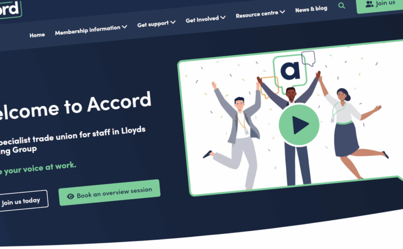
- Videos and photos: Accord included a video featuring real-life members sharing stories about why they joined the union. They recorded this at a reps’ event, and gained comments from a representative range of LBG workers. They also added photos and real-life examples from members to back up points about the benefits of joining. This all helped them convey social proof that the union is relevant to people directly like the page users, helping build trust and relatability.
- Concise Information: Aware of information overload new employees might face, Accord kept blocks of content concise, highlighting individual and collective benefits of membership, and providing a brief introduction to trade unions. The page tackles different arguments for joining, in separate sections – helping people skip to what resonates with them.
- Calls to Action: The page featured repeated calls to action in each block of content, encouraging visitors to directly join the union or book an 1-1 overview session with a relevant union staffer. This repetition is a recommended practice to ensure users can move straight from the argument that finally convinces them into taking action, without further distractions.
Technical Implementation
Accord made use of several new technical initiatives to develop the page.
- Unique URL: A dedicated page, only accessible from the link circulated by the employer helped them to track visits and interactions. The induction statistics reported to the union from the employer are only very general, so Accord aren’t able to get a full picture of the effectiveness of this route. But using their own website analytics and counts for call to action, they have been able to benchmark and analyse performance for the parts of the journey the union controls.
- Localised content: Using this landing page as a template, Accord have replicated and adapted to increase relevance for different major locations. Localised pages include details of the relevant workplace reps and regional officers, with their names, photos and contact details. This content is drawn automatically from current information held on Accord’s CRM, where reps have the option to make their full contact details public or not. Adding recognisable people and local details, which don’t go out of date as people change, helps the union demonstrate their direct relevance to a prospective member at work.
- Call booking: As well as adding a direct join call to action, Accord also found a way for people to book a 1-1 call at a time that suited them. For this, they used Microsoft Outlook’s Bookings app, which integrates with organisers’ calendars to let workers choose from available Teams call slots and send out reminders.
Next Steps
- Improving Data Tracking: The project is still new, so the union have not been able to track significant numbers through the three-stage journey yet. They are testing and refining their analytics, with a view to using the live data to revisit the effectiveness of the landing page over time.
- Developing the template: Accord’s website has been developed to let them use very flexible design element blocks to create more involved pages. That was really helpful in making a page with as many varied elements as this one. But the team have identified a couple of areas where the templates don’t quite let them do what they would like. They don’t want to over complicate the rest of the site, but they are incorporating design for a couple of new elements into a wider site revision project, aimed at helping them convey information snippets more effectively on landing pages in future.
View Accord’s new landing page
Interested in doing this at your own union?
The Digital Lab’s latest downloadable guide covers best practice in planning, designing and evaluating your website’s landing pages – the key pages in your website that convert visitors into taking action with the union.
When you have a limited opportunity to make contact with a group of users – as Accord realised they had in this case – any work you can do to improve the conversion rate of the page you are showing them will really pay off. Too often, we are sending hard-won contacts to pages that might only result in a small minority taking action. Simple steps to move your conversion rate even just from 10% to 20% would mean a doubling of results for the same campaign.
The guide has 10 recommendations for effective landing pages, and a suggested methodology for running a project to evaluate and improve your own most important pages and improve results.
Download the new guide here
Thanks to Hannah Palette and Chris Rimell at Accord for this case study of their work.